Website Changes
LEARN ABOUT THE MAJOR UPGRADE TO THE WEBSITE THAT CAME WITH THE 10TH EDITION
Website Changes
LEARN ABOUT THE MAJOR UPGRADE TO THE WEBSITE THAT CAME WITH THE 10TH EDITION
Edition 10—a major upgrade to the website
Also see: How to get copies of the text (for students), Information for Instructors and Changes in the 10th Edition text, which provides a short overview. Changes to individual chapters are found in Theory Resources under Changes.
As with any major upgrade, despite our best efforts, there will be errors, functional problems, and things that can be improved. If you spot errors or have comments or suggestions, use the Contact Form.
NOTE: With an upgrade to the site come changes that can affect bookmarks and links used for the previous version of the site. Please be aware of the following in particular:
- The site now has one common Home page, instead of separate Book and Instructors pages for general use or logged-in instructors.
- The use of underscores to represent spaces in urls (addresses) has been replaced with hyphens. This will cause many old bookmarks to fail. This change was made to make urls more legible when seen as an underlined link, where the underscore can be obscured.
The new website is built on the importance of making useful resources readily available to students and instructors. The 10th edition brings a new look (designed by Wally Ottenhoff) and rethinking the best ways to present the resources available (led by co-author Andrew Ledbetter and web consultant Stu Johnson, who has been working on the site since the 4th Edition). Let's look at some of the major changes:
New Look and Adaptability
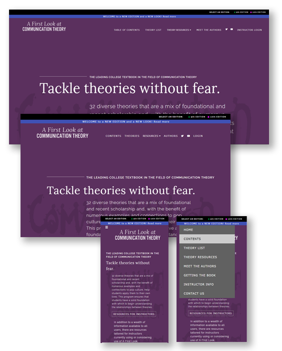
We knew that it was important to make the site more accessible on phones and tablets. The result is the site as you see it now, with "responsive" techniques that allow the site to work across a wide range of devices.
More than simply zooming in as device screens become smaller, responsive design adjusts the fit of the content before changing the size of text, allowing text to flow into larger vertical spaces. For example, on the Meet the Authors page, the photos get smaller but the text remains readable, and on small phones it switches to "mobile" layout, with the photos and text flowing vertically instead of side-by-side for each author.
At this time, Theory Resources are available only on larger devices, not on smaller phones. Because of the popularity of some resources among students, especially Self-Help Quizzes, we hope to bring more of them to all devices in the future. One trick that may work if you are using a phone: try rotating your phone to landscape orientation to see if more options become available.
Responsive styling can also serve as an Accessibility feature for those with needs for visual magnification. By using the zoom feature on the browser, the page continues to become larger, always fitting the device width. Zoom in far enough and the site appears in Phone/Mobile format.
Site performance may be limited by your device and Internet connection. While the site works very well on computers with a good broadband connection, we have noticed slow response in some WI-Fi settings and on smaller devices. Videos, for example, have been known to run poorly or not at all (which could be a result of data limitations on your service plan).
Edition Coverage
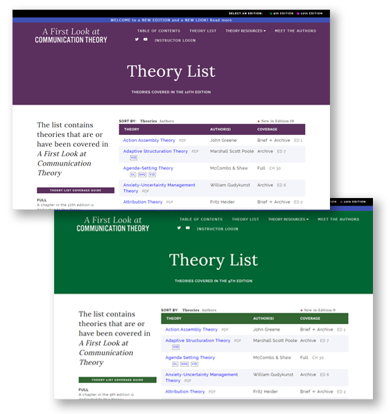
The upgraded site covers editions 9 and 10 of A First Look at Communication Theory. The edition selector has been moved to a simple text prompt at the upper right corner of every page. The edition you have selected is made obvious by the change of the masthead color to match the cover of that edition.

Theory Resources
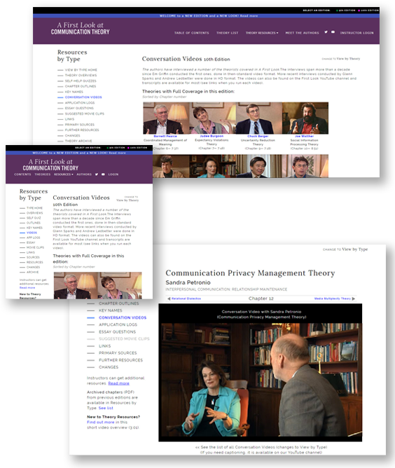
The heart of the site is the Theory Resources section that connects you to many details about the theories covered in A First Look. There are 13 available for all users and another five for registered instructors who are logged in. If you are new to Theory Resources, or did not explore them in depth on the old site, we've provided a video overview, About Theory Resources.
As before, you can enter Theory Resources from the Main Menu, or by clicking a theory name in the Table Contents or Theory List. When sorted by theory, the Theory list now includes "Quick Link" buttons to take you directly to Chapter Outlines, Self-Help Quizzes, and Conversation Videos. We've also added a drop-down selection for Theory Resources on the Main Menu that takes you directly to four of the most popular options, All Resources, or About Theory Resources. Our goal has been to make the resources as accessible as possible from different places on the site.
The two "views" in Theory Resources are carried over from the website for previous editions, with some significant changes:
- The overall look has changed, with a more subtle resource selector on the left side of the screen replacing the colored buttons on the old site. This left more room for the resource content.
- View by Type—here you will notice a major change.
While previous website versions followed the Context orientation of the text (still evident in the Table of Contents), we recognize that the way the text is used and made available today leads to a much greater reliance on chapters and specific theories. (This is evident from the choices that students have to get copies of A First Look.)
This led us to revise View by Type to show a list of the chapters with material available for a selected resource. You still have the option of viewing all of the content (the default on the old website). That can be handy for resources like Overview and Primary Sources, but produce very long content for resources like Chapter Outlines—but you now have that option.
- View by Theory—This view will be familiar to returning visitors. Content is selected by theory/chapter by selecting from the drop-down list in the Theory Selector, by using the Navigation Bar that walks through the Table of Contents, or by selecting a theory/chapter from the Table of Contents or Theory List pages. Once a theory or chapter is selected, the resource list will show which resources are available. Once a resource is selected, you can use the navigation bar to move through other chapters to view the same resource, or select another one (which will then "stick" as you navigate.
Other changes
A few other changes should be highlighted:
- Main Menu—The Logo serves as the menu prompt for the Home page. The Theory Resources option has a new drop-down list as described above. The layout of the menu changes with device size and appears as an abbreviated drop-down menu from the bars icon on small devices..
- Self-Help Quizzes—Andrew Ledbetter has added more questions to quizzes for the 10th Edition. One of the most popular features, we have tried to make it even more accessible by adding it to the new drop-down menu for Theory Resources. The quizzes can still be reached by clicking on a theory name in the Table of Contents or Theory List pages (look for the SHQ "Quick Link" button to go directly to the quiz), or by going to Theory Resources View by Theory and selecting a theory there.
- Theory Archive—To streamline Theory Resources View by Theory to include only chapters in the selected text, Archived chapters (those that appeared in earlier editions) are available three ways:
- Table of Contents or Theory List - clicking an archived chapter will open the PDF document
- Theory Resources View by Type—produces a list of all archived chapters as of the selected edition (i.e., the two theories dropped from Edition 9 will appear in the Edition 10 list)
- Text Comparison—this feature, which compares theory coverage in A First Look with ten of the other communication theory texts, remains available only to registered instructors who are logged in. Instead of the online version previously available, we are now providing the Text Comparison table only in PDF format, in three versions:
- Full list of all theories, by Context (Table of Content structure)
- Full list of all theories, sorted by theory name
- Comparison of theories covered in selected edition of A First Look
Also see: How to get copies of the text (for students), Information for Instructors and Changes in the 10th Edition text,
which provides a short overview. Changes to individual chapters are found in Theory Resources under Changes.
updated August 15, 2018
Edition 10—a major upgrade to the website
Also see: How to get copies of the text (for students), Information for Instructors and Changes in the 10th Edition text, which provides a short overview. Changes to individual chapters are found in Theory Resources under Changes.
As with any major upgrade, despite our best efforts, there will be errors, functional problems, and things that can be improved. If you spot errors or have comments or suggestions, use the Contact Form.
NOTE: With an upgrade to the site come changes that can affect bookmarks and links used for the previous version of the site. Please be aware of the following in particular:
- The site now has one common Home page, instead of separate Book and Instructors pages for general use or logged-in instructors.
- The use of underscores to represent spaces in urls (addresses) has been replaced with hyphens. This will cause many old bookmarks to fail. This change was made to make urls more legible when seen as an underlined link, where the underscore can be obscured.
The new website is built on the importance of making useful resources readily available to students and instructors. The 10th edition brings a new look (designed by Wally Ottenhoff) and rethinking the best ways to present the resources available (led by co-author Andrew Ledbetter and web consultant Stu Johnson, who has been working on the site since the 4th Edition). Let's look at some of the major changes:
New Look and Adaptability

We knew that it was important to make the site more accessible on phones and tablets. The result is the site as you see it now, with "responsive" techniques that allow the site to work across a wide range of devices.
More than simply zooming in as device screens become smaller, responsive design adjusts the fit of the content before changing the size of text, allowing text to flow into larger vertical spaces. For example, on the Meet the Authors page, the photos get smaller but the text remains readable, and on small phones it switches to "mobile" layout, with the photos and text flowing vertically instead of side-by-side for each author.
At this time, Theory Resources are available only on larger devices, not on smaller phones. Because of the popularity of some resources among students, especially Self-Help Quizzes, we hope to bring more of them to all devices in the future. One trick that may work if you are using a phone: try rotating your phone to landscape orientation to see if more options become available.
Responsive styling can also serve as an Accessibility feature for those with needs for visual magnification. By using the zoom feature on the browser, the page continues to become larger, always fitting the device width. Zoom in far enough and the site appears in Phone/Mobile format.
Site performance may be limited by your device and Internet connection. While the site works very well on computers with a good broadband connection, we have noticed slow response in some WI-Fi settings and on smaller devices. Videos, for example, have been known to run poorly or not at all (which could be a result of data limitations on your service plan).
Edition Coverage

The upgraded site covers editions 9 and 10 of A First Look at Communication Theory. The edition selector has been moved to a simple text prompt at the upper right corner of every page. The edition you have selected is made obvious by the change of the masthead color to match the cover of that edition.

Theory Resources

The heart of the site is the Theory Resources section that connects you to many details about the theories covered in A First Look. There are 13 available for all users and another five for registered instructors who are logged in. If you are new to Theory Resources, or did not explore them in depth on the old site, we've provided a video overview, About Theory Resources.
As before, you can enter Theory Resources from the Main Menu, or by clicking a theory name in the Table Contents or Theory List. When sorted by theory, the Theory list now includes "Quick Link" buttons to take you directly to Chapter Outlines, Self-Help Quizzes, and Conversation Videos. We've also added a drop-down selection for Theory Resources on the Main Menu that takes you directly to four of the most popular options, All Resources, or About Theory Resources. Our goal has been to make the resources as accessible as possible from different places on the site.
The two "views" in Theory Resources are carried over from the website for previous editions, with some significant changes:
- The overall look has changed, with a more subtle resource selector on the left side of the screen replacing the colored buttons on the old site. This left more room for the resource content.
- View by Type—here you will notice a major change.
While previous website versions followed the Context orientation of the text (still evident in the Table of Contents), we recognize that the way the text is used and made available today leads to a much greater reliance on chapters and specific theories. (This is evident from the choices that students have to get copies of A First Look.)
This led us to revise View by Type to show a list of the chapters with material available for a selected resource. You still have the option of viewing all of the content (the default on the old website). That can be handy for resources like Overview and Primary Sources, but produce very long content for resources like Chapter Outlines—but you now have that option.
- View by Theory—This view will be familiar to returning visitors. Content is selected by theory/chapter by selecting from the drop-down list in the Theory Selector, by using the Navigation Bar that walks through the Table of Contents, or by selecting a theory/chapter from the Table of Contents or Theory List pages. Once a theory or chapter is selected, the resource list will show which resources are available. Once a resource is selected, you can use the navigation bar to move through other chapters to view the same resource, or select another one (which will then "stick" as you navigate.
Other changes
A few other changes should be highlighted:
- Main Menu—The Logo serves as the menu prompt for the Home page. The Theory Resources option has a new drop-down list as described above. The layout of the menu changes with device size and appears as an abbreviated drop-down menu from the bars icon on small devices..
- Self-Help Quizzes—Andrew Ledbetter has added more questions to quizzes for the 10th Edition. One of the most popular features, we have tried to make it even more accessible by adding it to the new drop-down menu for Theory Resources. The quizzes can still be reached by clicking on a theory name in the Table of Contents or Theory List pages (look for the SHQ "Quick Link" button to go directly to the quiz), or by going to Theory Resources View by Theory and selecting a theory there.
- Theory Archive—To streamline Theory Resources View by Theory to include only chapters in the selected text, Archived chapters (those that appeared in earlier editions) are available three ways:
- Table of Contents or Theory List - clicking an archived chapter will open the PDF document
- Theory Resources View by Type—produces a list of all archived chapters as of the selected edition (i.e., the two theories dropped from Edition 9 will appear in the Edition 10 list)
- Text Comparison—this feature, which compares theory coverage in A First Look with ten of the other communication theory texts, remains available only to registered instructors who are logged in. Instead of the online version previously available, we are now providing the Text Comparison table only in PDF format, in three versions:
- Full list of all theories, by Context (Table of Content structure)
- Full list of all theories, sorted by theory name
- Comparison of theories covered in selected edition of A First Look
Also see: How to get copies of the text (for students), Information for Instructors and Changes in the 10th Edition text,
which provides a short overview. Changes to individual chapters are found in Theory Resources under Changes.
updated August 15, 2018
Edition 10—a major upgrade to the website
Also see: How to get copies of the text (for students), Information for Instructors and Changes in the 10th Edition text, which provides a short overview. Changes to individual chapters are found in Theory Resources under Changes.
As with any major upgrade, despite our best efforts, there will be errors, functional problems, and things that can be improved. If you spot errors or have comments or suggestions, use the Contact Form.
NOTE: With an upgrade to the site come changes that can affect bookmarks and links used for the previous version of the site. Please be aware of the following in particular:
- The site now has one common Home page, instead of separate Book and Instructors pages for general use or logged-in instructors.
- The use of underscores to represent spaces in urls (addresses) has been replaced with hyphens. This will cause many old bookmarks to fail. This change was made to make urls more legible when seen as an underlined link, where the underscore can be obscured.
The new website is built on the importance of making useful resources readily available to students and instructors. The 10th edition brings a new look (designed by Wally Ottenhoff) and rethinking the best ways to present the resources available (led by co-author Andrew Ledbetter and web consultant Stu Johnson, who has been working on the site since the 4th Edition). Let's look at some of the major changes:
New Look and Adaptability

We knew that it was important to make the site more accessible on phones and tablets. The result is the site as you see it now, with "responsive" techniques that allow the site to work across a wide range of devices.
More than simply zooming in as device screens become smaller, responsive design adjusts the fit of the content before changing the size of text, allowing text to flow into larger vertical spaces. For example, on the Meet the Authors page, the photos get smaller but the text remains readable, and on small phones it switches to "mobile" layout, with the photos and text flowing vertically instead of side-by-side for each author.
At this time, Theory Resources are available only on larger devices, not on smaller phones. Because of the popularity of some resources among students, especially Self-Help Quizzes, we hope to bring more of them to all devices in the future. One trick that may work if you are using a phone: try rotating your phone to landscape orientation to see if more options become available.
Responsive styling can also serve as an Accessibility feature for those with needs for visual magnification. By using the zoom feature on the browser, the page continues to become larger, always fitting the device width. Zoom in far enough and the site appears in Phone/Mobile format.
Site performance may be limited by your device and Internet connection. While the site works very well on computers with a good broadband connection, we have noticed slow response in some WI-Fi settings and on smaller devices. Videos, for example, have been known to run poorly or not at all (which could be a result of data limitations on your service plan).
Edition Coverage

The upgraded site covers editions 9 and 10 of A First Look at Communication Theory. The edition selector has been moved to a simple text prompt at the upper right corner of every page. The edition you have selected is made obvious by the change of the masthead color to match the cover of that edition.

Theory Resources

The heart of the site is the Theory Resources section that connects you to many details about the theories covered in A First Look. There are 13 available for all users and another five for registered instructors who are logged in. If you are new to Theory Resources, or did not explore them in depth on the old site, we've provided a video overview, About Theory Resources.
As before, you can enter Theory Resources from the Main Menu, or by clicking a theory name in the Table Contents or Theory List. When sorted by theory, the Theory list now includes "Quick Link" buttons to take you directly to Chapter Outlines, Self-Help Quizzes, and Conversation Videos. We've also added a drop-down selection for Theory Resources on the Main Menu that takes you directly to four of the most popular options, All Resources, or About Theory Resources. Our goal has been to make the resources as accessible as possible from different places on the site.
The two "views" in Theory Resources are carried over from the website for previous editions, with some significant changes:
- The overall look has changed, with a more subtle resource selector on the left side of the screen replacing the colored buttons on the old site. This left more room for the resource content.
- View by Type—here you will notice a major change.
While previous website versions followed the Context orientation of the text (still evident in the Table of Contents), we recognize that the way the text is used and made available today leads to a much greater reliance on chapters and specific theories. (This is evident from the choices that students have to get copies of A First Look.)
This led us to revise View by Type to show a list of the chapters with material available for a selected resource. You still have the option of viewing all of the content (the default on the old website). That can be handy for resources like Overview and Primary Sources, but produce very long content for resources like Chapter Outlines—but you now have that option.
- View by Theory—This view will be familiar to returning visitors. Content is selected by theory/chapter by selecting from the drop-down list in the Theory Selector, by using the Navigation Bar that walks through the Table of Contents, or by selecting a theory/chapter from the Table of Contents or Theory List pages. Once a theory or chapter is selected, the resource list will show which resources are available. Once a resource is selected, you can use the navigation bar to move through other chapters to view the same resource, or select another one (which will then "stick" as you navigate.
Other changes
A few other changes should be highlighted:
- Main Menu—The Logo serves as the menu prompt for the Home page. The Theory Resources option has a new drop-down list as described above. The layout of the menu changes with device size and appears as an abbreviated drop-down menu from the bars icon on small devices..
- Self-Help Quizzes—Andrew Ledbetter has added more questions to quizzes for the 10th Edition. One of the most popular features, we have tried to make it even more accessible by adding it to the new drop-down menu for Theory Resources. The quizzes can still be reached by clicking on a theory name in the Table of Contents or Theory List pages (look for the SHQ "Quick Link" button to go directly to the quiz), or by going to Theory Resources View by Theory and selecting a theory there.
- Theory Archive—To streamline Theory Resources View by Theory to include only chapters in the selected text, Archived chapters (those that appeared in earlier editions) are available three ways:
- Table of Contents or Theory List - clicking an archived chapter will open the PDF document
- Theory Resources View by Type—produces a list of all archived chapters as of the selected edition (i.e., the two theories dropped from Edition 9 will appear in the Edition 10 list)
- Text Comparison—this feature, which compares theory coverage in A First Look with ten of the other communication theory texts, remains available only to registered instructors who are logged in. Instead of the online version previously available, we are now providing the Text Comparison table only in PDF format, in three versions:
- Full list of all theories, by Context (Table of Content structure)
- Full list of all theories, sorted by theory name
- Comparison of theories covered in selected edition of A First Look
Also see: How to get copies of the text (for students), Information for Instructors and Changes in the 10th Edition text,
which provides a short overview. Changes to individual chapters are found in Theory Resources under Changes.
updated August 15, 2018
Copyright © Em Griffin 2026 | Web design by Graphic Impact


